Procore Document Management on Mobile

Mobile iOS and A
Overview
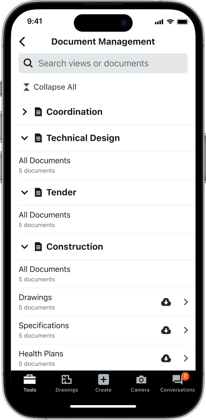
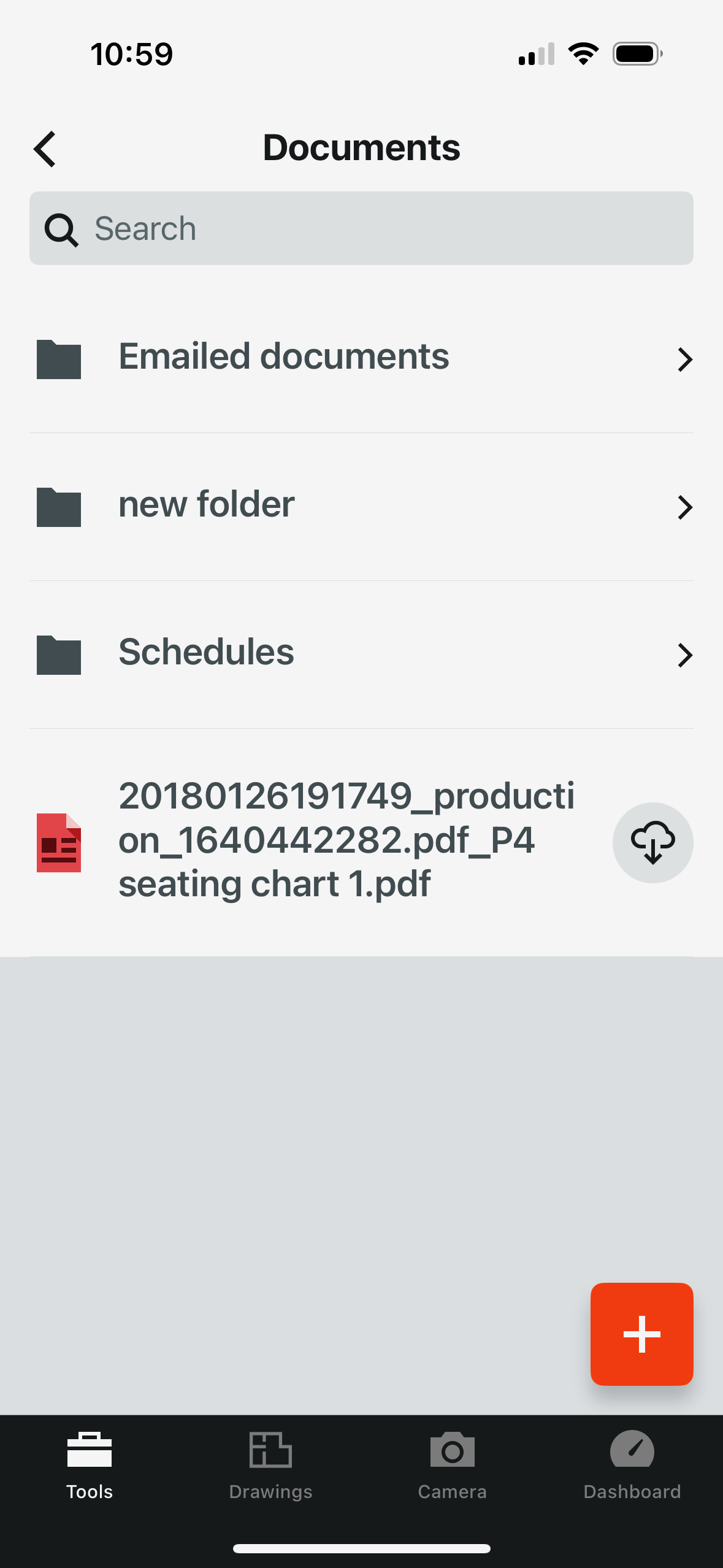
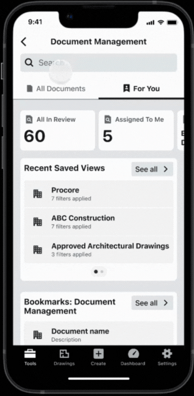
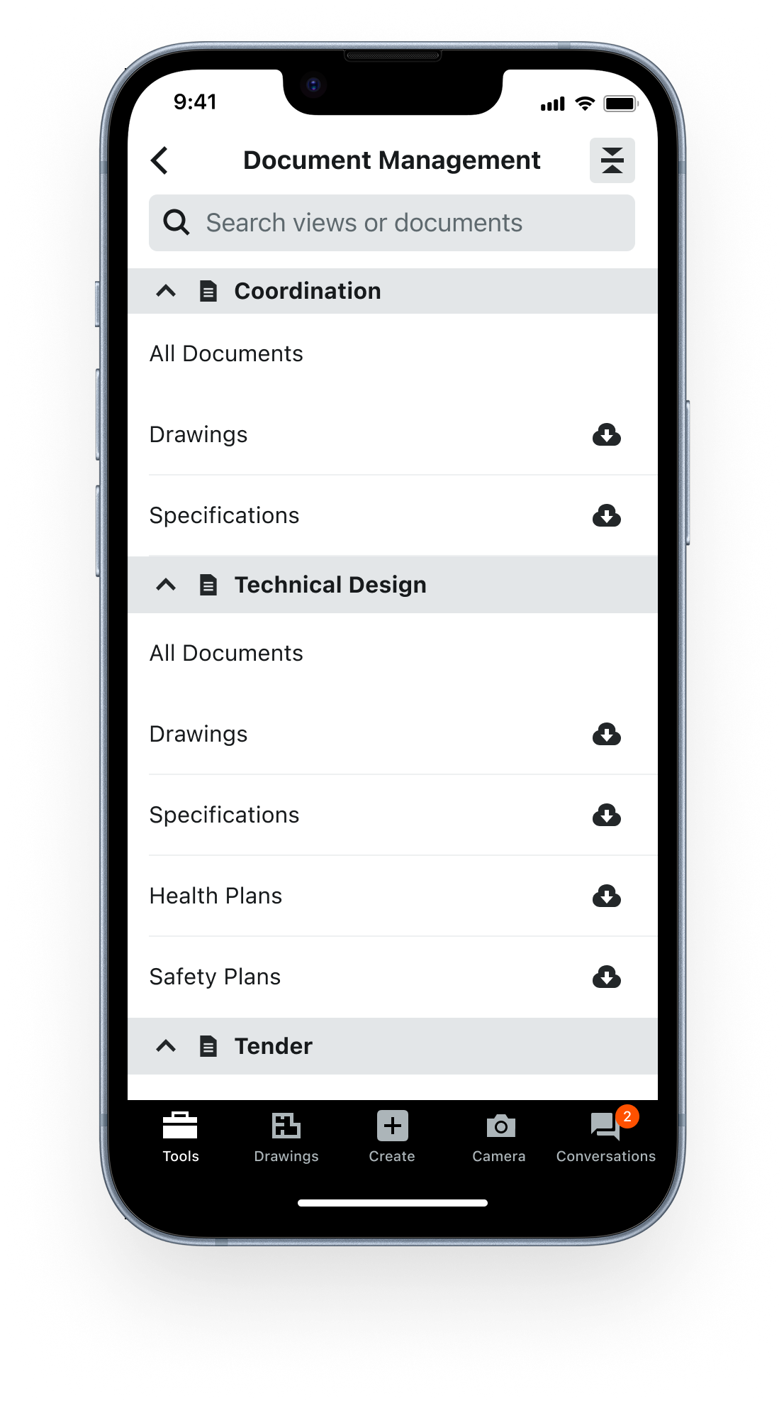
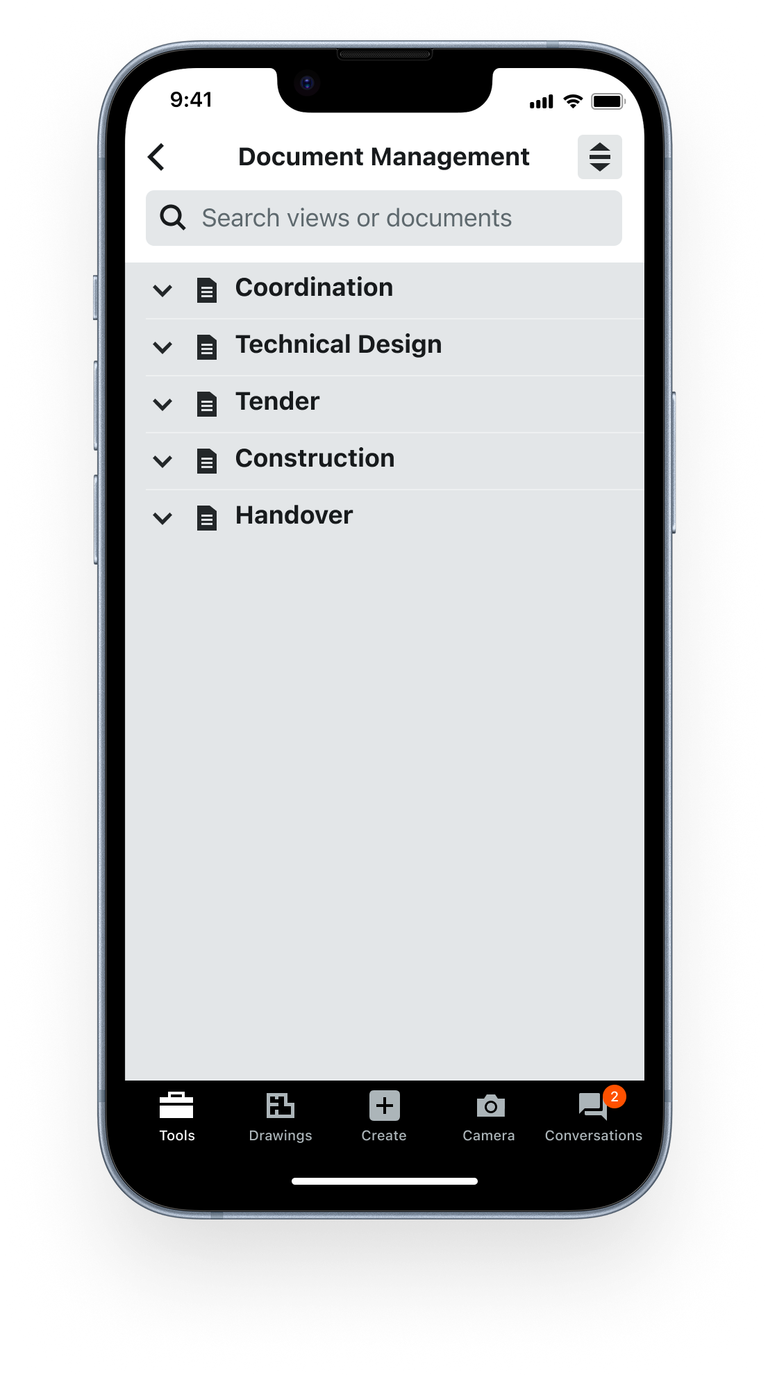
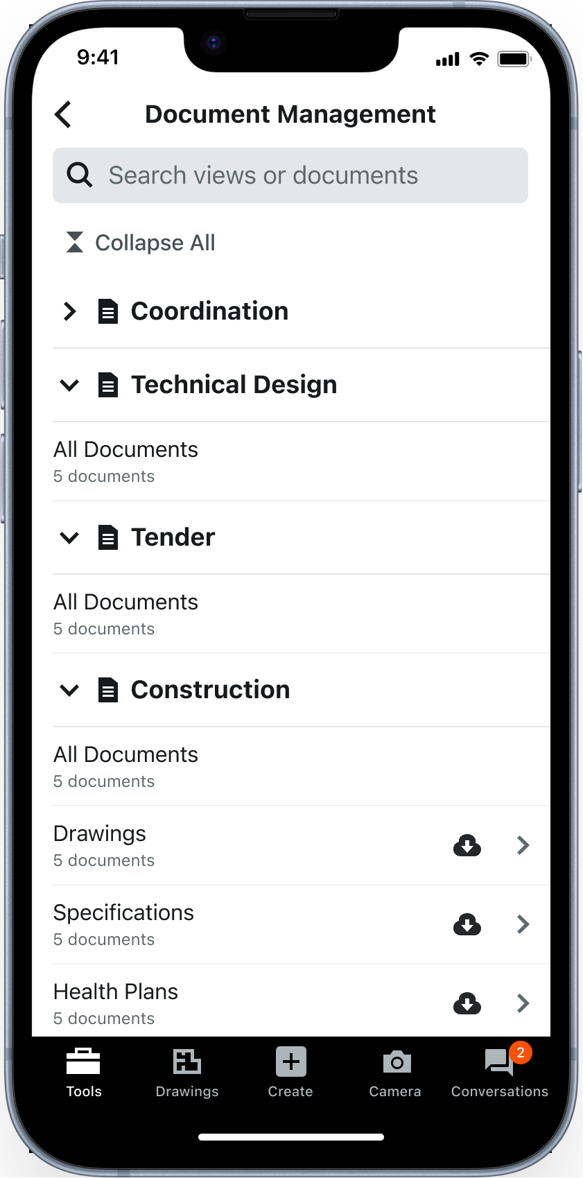
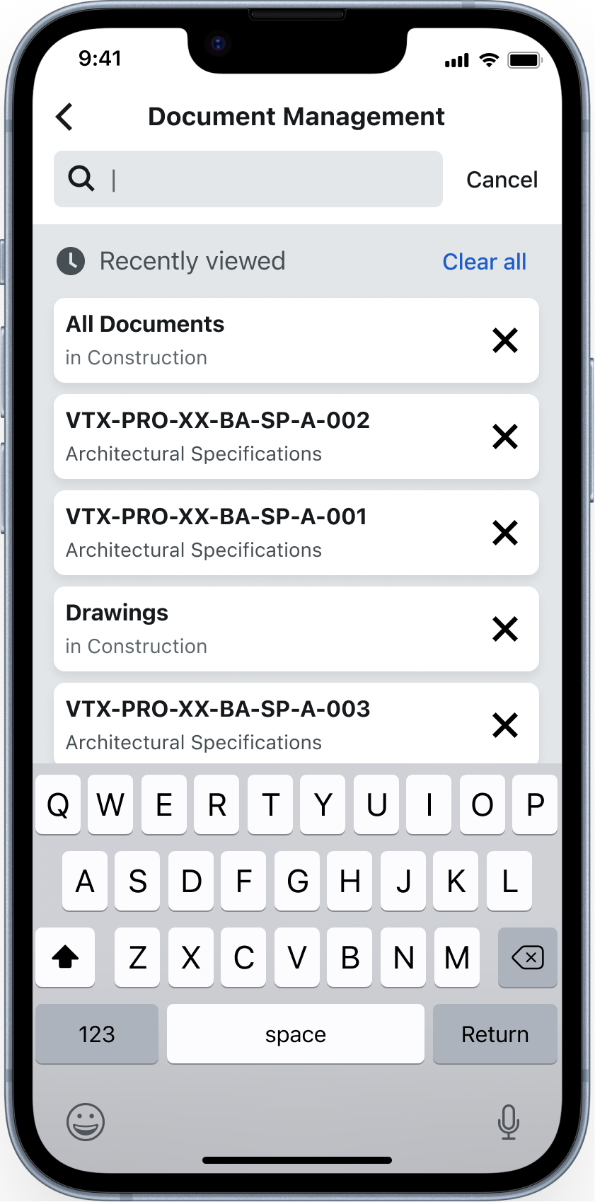
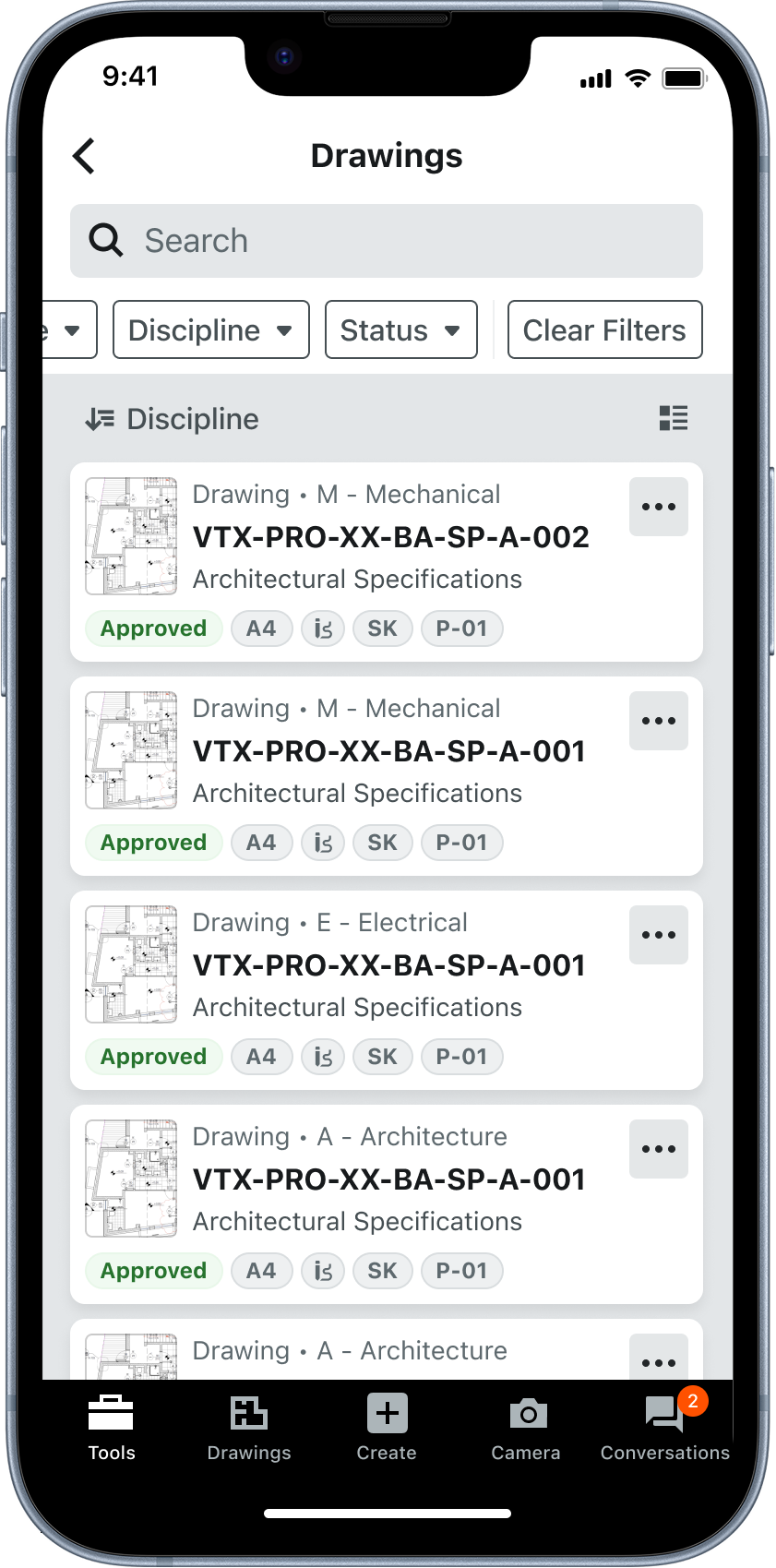
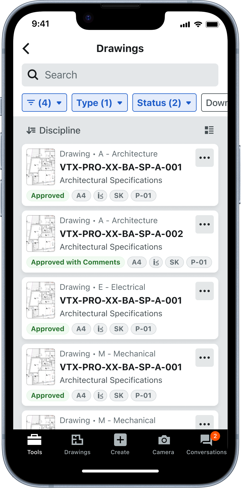
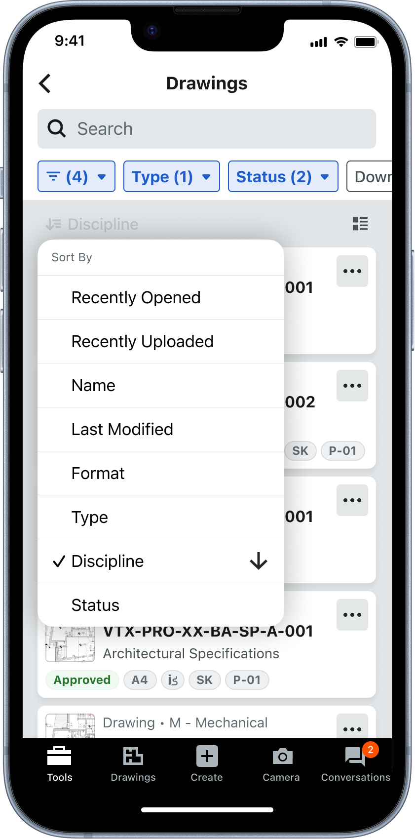
Construction field crews waste time hunting for files because the mobile Documents tool buries them in a rigid folder tree that forces extra drilling on small screens. With no global search or access to useful metadata, many users head down the wrong folder path and have to start over, stretching sessions and fraying patience. Procore's goal is to provide the first fully connected and trusted document solution for everyone in construction.
Role
Lead Mobile Designer
Main Use Case
Quick access for field users
Timing
6 months
Team
Product Manager, Enigneering Manager, Developers, UX Researcher, UX Content Designer
Background: It was the #1 company initiative and originally, Procore Document Management (PDM), started as a web-only initiative and thus selective research was already done and the first pass of mobile designs were already complete.
Project Objectives
current problem
A core problem was that users had to tap more than 3 times to get to a document in 49% of cases. The information was structured in a tree-like hierarchy, necessitating browsing through multiple folders and files. It was difficult to measure if these were successful browsing experiences or if users found the incorrect document or navigated through the wrong folder structure. Furthermore, the lack of a global search feature exacerbated this issue.

# of taps to view documents

business goals and product alignment
As the #1 company initiative, mobile needed to be in lock step with the web platform to create a mobile solution to solve field workers' needs of easy access in the field while also keeping it aligned with web's super users.
Key Metrics
# of document views
# of taps to
view document
session time
Research
target audience
Workers in the Field
Our primary target audience was field users, including superintendents, project managers, foremen, engineers, and architects. These individuals rely on accurate and accessible documents to be productive on physical construction sites. It was also critical that the solution would support international markets.
primary research
Pilot Feedback
With access to an internal customer council, feedback loops were early and often. Moderated interviews, unmoderated testing, and site visits were common research methods that I implemented throughout the project.

The initial pilot feedback was as expected but needed improvements with: 
  • Clearer filtering
  • Better structure that follows users' current mental model more
  • Less confusing buttons and UI
Design Explorations
Design sprint
To act on the feedback we got from the initial phase release, my partner web designer and I did a week long design sprint that ending with moderated user testing of the concept.
Competitive analysis spreadsheet

Initial wireframes

Feedback
Structural needs for users' mental models were addressed. Based on feedback from moderated testing sessions we learned that everything was heading in the right direction with personalization and having more folder structure but users still found the concept of mobile breadcrumbs and group by confusing.

While super users would benefit from a more "dashboard" like appearance on the main Document Management page, laborers still struggled and noted "too much clutter"was distracting.  
"What I see is something that is more familiar to what I expect from a document management tool. I think this is a massive step forward for Procore."
Final Designs
Phase 1
The cards in the last iteration were too much visual noise so I paired it back to the basics with a simple grouped list.

To make the deadline for our Regional GA release, I had to stay within the current design system so engineering didn't have to create a new system component. It doesn't leave a great UI and causes some visual confusion. Thus, a Phase 2 design was created post-Regional GA release.

Phase 2
This early solution works for users both in the office and the field with clear organization. To give mobile users that quick and easy access to their documents, we implemented a Collapse All feature to the folders and improved the search experience to cover more metadata and include Recently Viewed documents.

Updates: 
  • Collapse all viewing capability
  • Syncing saved views for offline use in the field
  • More robust search experience
  • Additional sorting fields
  • Updated card UI to align with design system
Outcome
results & Reflections

Results from Regional GA release in Mar 2022 to now showing significant increase in unique companies using documents on a mobile device.

For the first regional GA release, I had to cut the My Views/For You personalization on mobile so the flow lines up with the web app. Consistency mattered more than adding a new feature, given Procore’s track record of mismatched experiences.

Down the road, web and mobile can each play to their strengths, but we need a clear plan that respects field constraints and tech limits.

I wish we’d tested live prototypes on-site; that feedback would have helped the web team see things through our users’ eyes.

After the org reshuffle I handed the project to the web designers and now jump in as a mobile consultant whenever they need context.